With large format printing, there can (literally!) be more room for error, so there are a number of potential large-format printing mistakes. With these kinds of graphics, it’s absolutely imperative that you get your message across in the right way. Here, we take a look at some of the large-format printing errors that crop up – and what you can do about them.
What Is Large Format Printing?
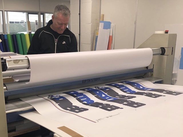
Large-format printing, generally speaking, refers to graphics 5m wide or bigger, and is often used for billboards and building wraps. However, you’ll frequently spot these graphics in other places, too, from event and stadium signage to retail, exhibitions and hoardings at building sites.
It’s also sometimes called wide-format printing, and can be cost-effective even for smaller print runs, with the right machinery. Different materials and processes can be used according to the application. Wide-format printing can even be done with stiff materials such as foam board, and thick PVC with the use of a special flatbed printer.
Some Common Large Format Printing Pitfalls
As with standard-format printing, there are a number of large-format printing pitfalls. This list is not exhaustive – but here are some of them, with tips on how to avoid them.
#1 Too much text
As a rule of thumb, aim for between five and seven words for your printed product. Research shows that most people stop reading advertising boards whose messages are much longer than five words. So while it can be tempting to cram more information in, the old cliché of less is more applies here – as does the truism that a picture is worth a thousand words.
So you will find, for example, that a pithy hashtag or slogan has more power than even a small paragraph.
#2 Trying to use all available space
Clearly, large-format printing is all about having more space. But just because you have it doesn’t mean you have to use it all, tempting though that may seem. Adding too much detail can detract from a graphic’s impact quite significantly.
Especially when viewed from a distance, overall messaging can be diminished. Focus on the overall impression, and don’t worry about leaving some empty space in your design. Bold messaging stands out and is more memorable.
#3 Getting colour choice wrong
Unfortunately, this is another of the common large-format printing errors. Problems can range from using too many different shades (you probably want to stick to no more than three hues) to opting for colours which blend together and thus camouflage the message you want to convey.
Some of the things to steer clear of include light colours on a white background, bright colours against equally vivid shades, for example green on orange or bright colours on a white background. Instead, go for strongly contrasting hues, particularly as far as text is concerned.
Once again (because we can’t stress it enough), bold, simple signs that are noticeable from a long way off will stand out more.
Using Pantone colours within your design can help you match large-scale graphics with other items to ensure consistency.
#4 Getting the bleed wrong
The ‘bleed’ is the printing that goes over the edge of where the sheet is going to be trimmed, i.e. it is the area to be trimmed off. In large-format printing, you may need a greater bleed than usual. So it is important that you check the size of bleed needed with your print manager.
#5 Using graphics that are too low-resolution
This is another of the large-format printing pitfalls. Clearly, it can be an issue in standard-format printing too, but it’s even more vital when you’re increasing the scale of your graphics. Avoid low-res graphics at all costs. Ideally, you would settle for no quality lower than 100dpi at full scale (so 400dpi at 25%). Higher dpi resolutions can mean very big file sizes, but you need to ensure a crisp look, especially from a distance.
#6 Using RBG and not CMYK
On a screen, the primary RGB (red/green/blue), base colours are used to form just about every other shade, while in print CMYK (cyan/magenta/yellow/black) are generally what professionals use. For large-format projects (and indeed for standard-format work too), your colours may look rather off if you go for RGB rather than CMYK hues. CMYK gives greater colour accuracy, particularly on a bigger scale, although RGB handles smaller file sizes well.
#7 Not taking care with fonts and design features
Not everything that looks great for small-scale projects like business cards and brochures will translate to a large-print format. Go for designs which also look good from a distance as well as close up, with contrast colours and easily legible fonts.
#8 Not using a professional designer
The rise of online print services (in which you upload your own artwork) has made large-format printing more accessible than ever. So it’s never been easier to learn a few Photoshop tricks and knock up your own designs, bypassing the input of a professional designer. However, this could well prove a false economy. Unless you have a background in printing, you may not be aware of things like bleeds, file formats or getting colour spot-on. Or you could select colours which merge so that they hide your message.
A professional designer can, as a bare minimum, make your design ready for print, tidying it up in the process. And you can save a lot of time and money with their input and avoid the usual large-format printing mistakes.
Looking For a Professional Large Format Print Company?
At Rocket, we’re a specialist large-format printing company of more than 30 years’ standing. We take the quality of final finished products seriously, for example using Pantone colours to identify the perfect match for your brand. We carry out a wide range of large-format printing jobs for a wide variety of clients, many of them household names, from signage production and large-format vinyl graphics to wall wraps, plus stadium and hoarding signage.
Give us a call today to talk about what you need.